Creating a proper scatter plot in Excel can be more
difficult than you’d think. If you want text at the bottom of the chart you
have to use a line graph and remove the lines.
If you do it this way you can update categories and data with ease. Follow below for a step by step guide to scatter plots with text in the x axis:
If you do it this way you can update categories and data with ease. Follow below for a step by step guide to scatter plots with text in the x axis:
How to create a scatter plot:
1
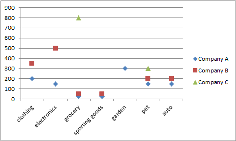
To demonstrate, here is a sample data set I made up.
Create the scatter plot by selecting the entire
data set from B3:E10.
A.
Select the “Insert Tab” to the right of the “Home
Tab” at the top right of the screen.
B.
Click Scatter in the “Charts” section. Select “Scatter
with only Markets”.


Notice the x axis is numbers, even
though the data is text. To fix this change the graph to a line graph
Select
the graph by left clicking. You’ll see a green area appear in the upper left
portion of “tabs”. Select the design tab, left click the “Change Chart Type”
option. Select the line graph and the line graph with markers. Then click OK.


Your graph should now look like
below:

1.
Right click and select “Format Data Series”
2.
Select “No Line” in the Line color tab.
3.
Close the “Format Data Series” menu.

The chart should look like this:

Now remove the zero values from the chart.
1. For each series, select the series by left clicking a data point and go to “Design” tab in the green chart tools menu at the upper right.
2. Click “select data”


Select show empty cells as “Gaps”
Click OK. Then Click OK again on the Select Data
Source Box to accept changes.
Your finished scatter plot should look like the
one below.
No comments:
Post a Comment